Work















As an accomplished Project Architect with Project Management experience, my confident exploration of form and material is rooted in an appreciation of people, places and spaces.
As a champion of teamwork, I believe critical thinking, organization, compassion, and leading by example are fundamental values of a healthy culture.
I am licensed in Pennsylvania and am always looking for new growth opportunities. If you are interested in working together then please get in touch!
https://issuu.com/sblm/docs/a_bold_architectural_bet_transformed_this_long_isl
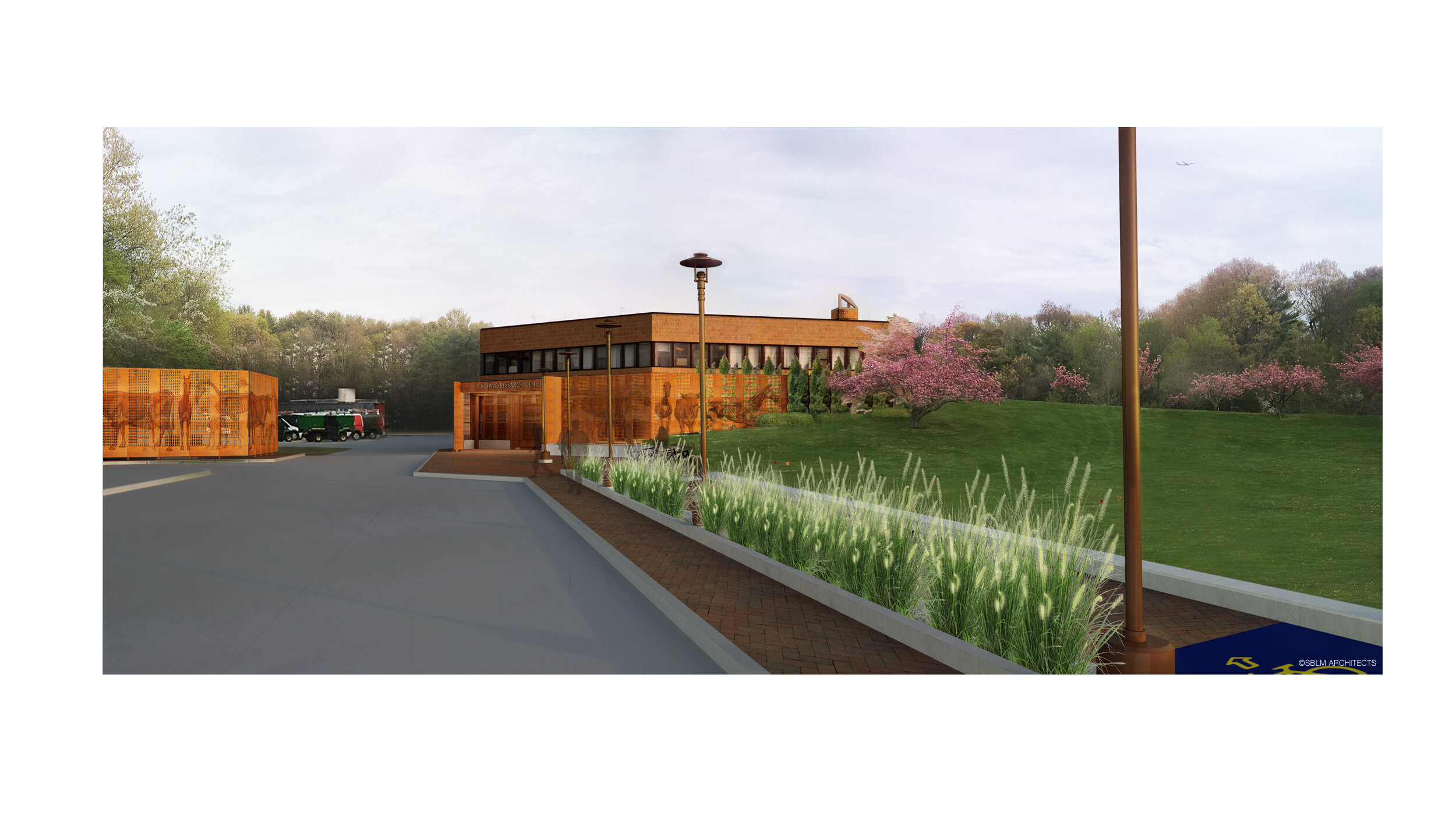
A University released an RFP for the design and development of a College of Veterinary Medicine on its rural campus. The innovative and research based curriculum had initially been spread across a learning center, research facility, and an administration hall. As a lead designer, my contributions to the design approach began with concept designs that explored typology and site. In turn, the collaborative efforts between a Principal and myself resulted in the firm securing its first ground-up, Higher Education award.
Anchoring one end of the North-South axis is a flexible space designed for day-to-day cross circulation while creating an elegant pre and post function gathering space. As an entry point into the South Building from the Great Lawn, the space plays a significant role in conveying the importance of donor support to the program and sets the tone for the spaces encountered throughout.
The program required three Lecture Halls to accomodate 150 seats a piece, 300 of which would function as study halls for CVM students outside of lesson hours. The remaining 150 seats located in the South Wing would also serve the broader community during special events. Attention was paid to craft an environment conducive for learning while expressing the program’s brand.
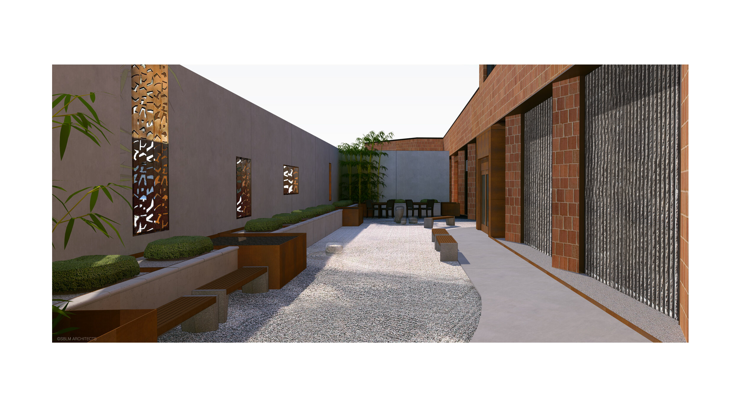
On the edge of campus, a 15’ high screen-wall cuts through the hillside, announcing a new destination while rooting the existing building to the land. Articulated in weathering steel plates perforated with thematic patterns the plane folds in to carve out space at the entrance marked by lettering and an illuminated monument sign. A landscaped path separating circulation types reaches out to guide pedestrians from campus.
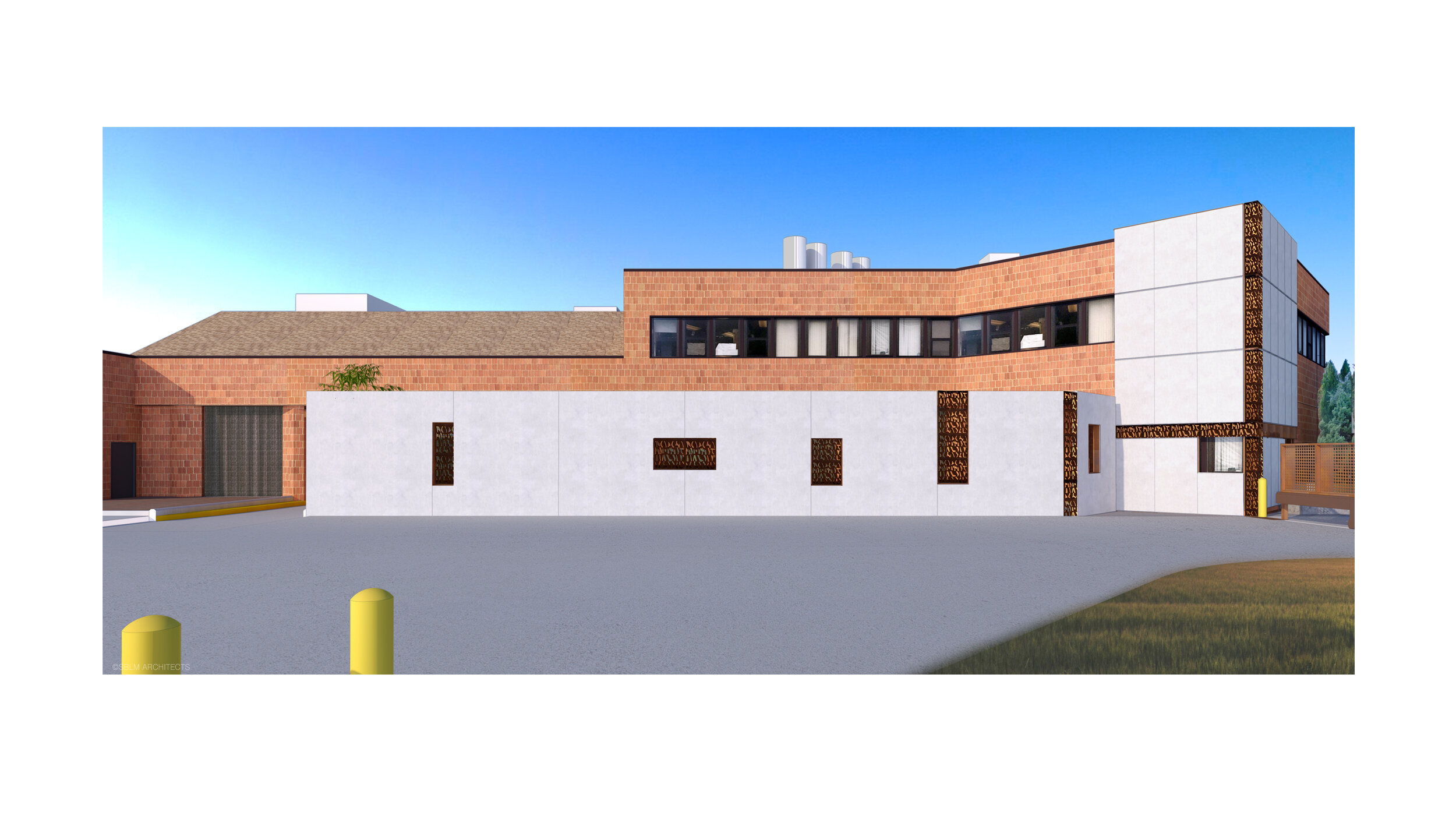
As the plan for the research component of the CVM program transformed through schematic’s, the entry point shifted along the building’s torso to an area laden with the atmosphere of facilities operations and rough, impervious surfaces. A suite of tilt-up precast panels is arranged to carve out and shore up a softer entry sequence while revealing frames for borrowed scenery at their joints.
[Process] Contextualization
[Process] Detail development
Millions of small vents are bored from the street surface through to the ceiling of a subway platform. Each vent is then fitted with a temperature sensing assembly where the surfaces of the blades of a vertical axis turbine serve as contact thermometers. LED's that puncture the ceiling below become the performative units of the array and are programmed to shift color to a corresponding temperature. Local temperature fluctuations seen from afar magnify visually into waves lapping across the system.
This conceptual design for a ground-up fire station is efficiently positioned to guide the approach and departure of firefighting apparatus. In plan, the sequencing of turning radii act to carve away at the edges of an urban corner lot casting the apparatus bays in a sawtooth configuration in the process. Culminating in an inviting ground floor community center adjacent to nearby residents, the training and fitness centers hover prominently above, veiled in a translucent channel glass.
A multi-unit development poised along a quiet residential street responds to its narrow site with attention to proportion and elegant detailing. The eighteen-foot floor to ceiling heights found within are framed on the exterior by fenestrations composed of hand-crafted brick that subtly increase more vision as the building elevates. A module rotated against the ground plane in the rear yard borrows skylight for the ground floor duplex.
Thrown into the mix as a junior designer after a significant round of cost-cutting and scope reduction, I demonstrated exceptional composure, resourcefulness, and capacity to clarify, coordinate, document, and administrate the amended work amongst the project team, contractors and in-house expediting team to facilitate project execution.
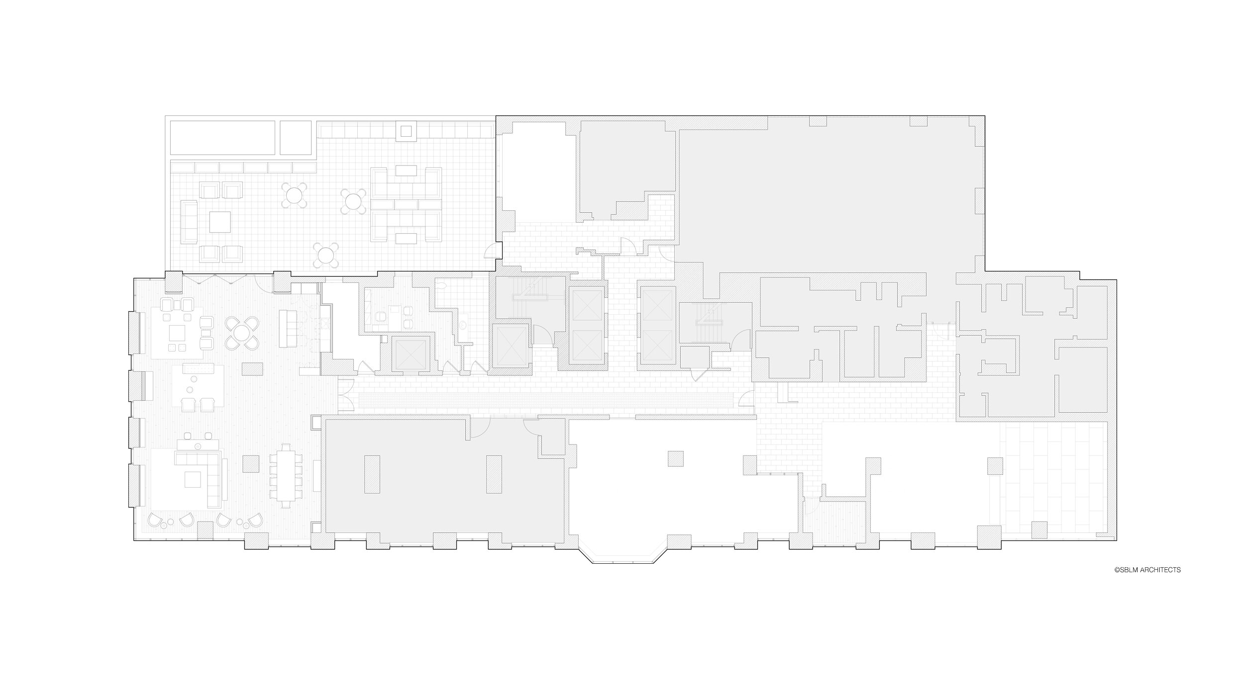
The former Leasing Center was converted into a Tenant Lounge and features a stone clad fireplace, new engineered hardwood floors and built-in shelving that was designed to conceal existing perimeter radiators.
A prominent property owner approached the firm with a need to modernize common and amenity spaces across a couple of their mid-town properties. The scope included lobbies, tenant lounges, tenant gyms, a roof-top deck, residential corridors, and elevator cabs. With the full scope of work awarded between two contracting outfits, I gained valuable experience conducting site observations, reviewing shop drawings, and building rapport with representatives at varying levels during Construction Administration.
Folded within the program for an Early Childhood / Elementary Day school is this space to study. Students collect study material from built-in shelving set into natural stone-clad walls reminiscent of the Walls of Jerusalem while in-direct lighting emanates between refinished timber spanning overhead. The softened, meditative tone of the interior echoes into the garden beyond.
A compact transitional space provides access to the Community Facility program on the upper floors. The design is conceived to reflect the staccato articulation that characterizes the qualities of its surrounding context. Matching the volume of a typical vaulted bay found underneath the elevated 7 Line, a complimentary palette of blackened, cold rolled steel and honed limestone are sliced by vectors of light, drawing a visitors gaze in directions that trace the edges of the space and influence a pulse of implied movement.
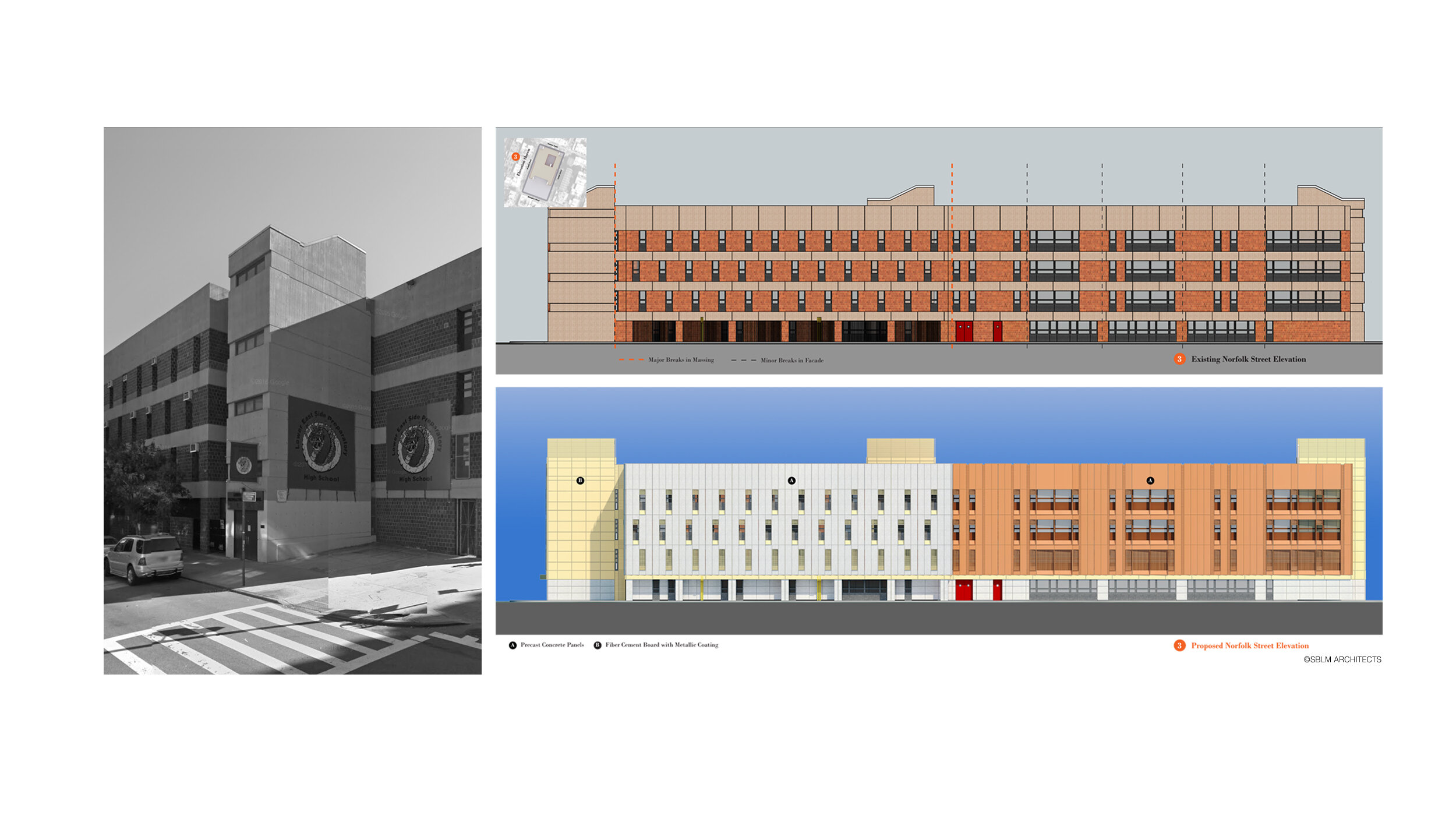
Located in the eclectic Lower East Side where deep historic ties are expressed in the scale of its gritty streets and the tenements, an anachronistic building owned by the NYCSCA massively displaces one full city block in brutal and often deteriorating conditions. With full repairs and retrofits to current energy codes off of the table, we were tasked to propose protective measures that would least disrupt the critical functioning of the building that serves three public schools and the community.
Stacked precast panels propose a novel, vertical reading of the facade. Arranged in a saw-tooth pattern, the face is activated by frequent, short shadows that together create the effect of pages turning throughout the day. A precast base runs the full perimeter of the building, tying together the pedestrian experience to be celebrated with refreshed artwork at the inner corners.
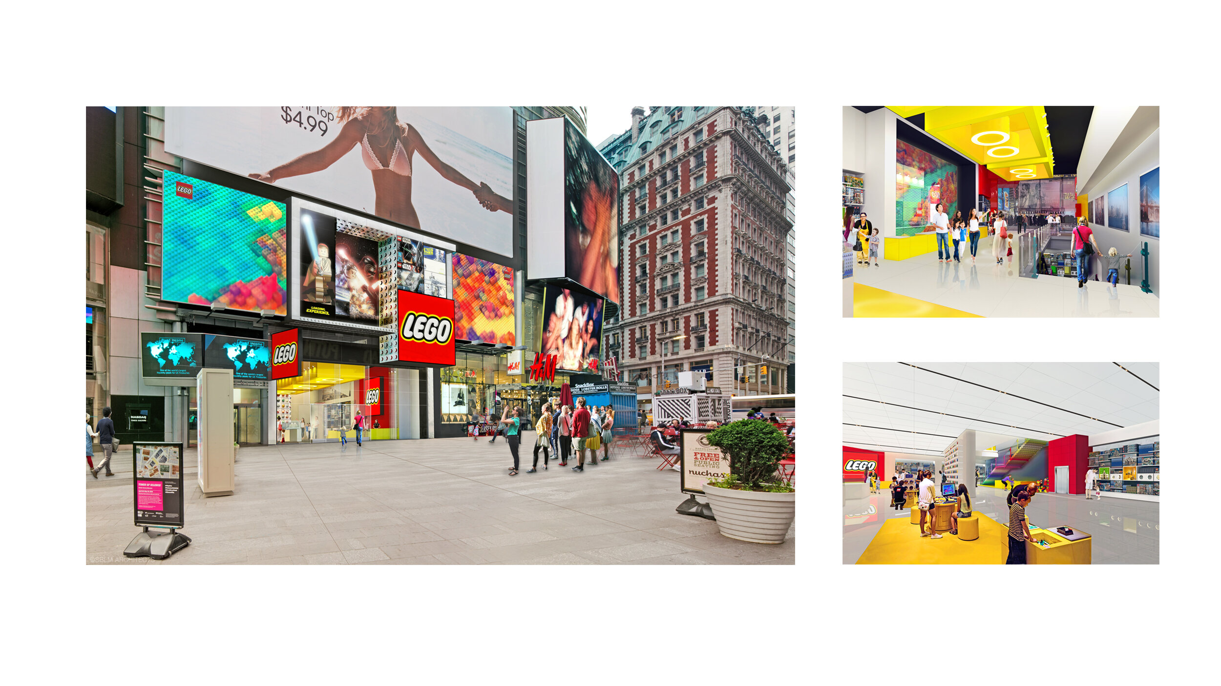
In a building adjacent to Madison Square Garden, a Metropolitan Transit Authority (MTA) easement had expired, making 40,000 SF across four (4) levels available for speculation. Working directly with a firm principal and the development team, I prepared a series of leasing schemes to explore alternative uses for the owner to market the highest and best utilization of the asset.
Explored a series of developer-partnered zoning and tenant mix scenarios evaluated to expressly strengthen an existing asset. Studies included: Architectural possibilities from zoning lot merger, Inclusionary Housing, Repositioning of Zoning FAR within Tower Base, Street-wall redesign based on tenant-specific branding. Functioned as the Architectural Designer and Coordinator.
As an urban pattern, The Village of Arts and Humanities in Philadelphia can be experienced as a labyrinth of ambiguous open spaces. These spaces are activated by multiple art forms during the day, ranging from murals made of mosaic to playful sculptural figures. The material, detail, and arrangement of these forms pass on to us as visitors a rich reading of the Village’s history and aggregating memories. This Vitetta Best and Brightest award-winning proposal provides a thoughtful, sustainable and cost-effective strategy to proudly illuminate these open spaces - moreover, it proposes a method to claim the ambiguity of night and artfully weaves together a cohesive urban experience.
This entry for the Pin Architecture competition series employ’s the bacterium Bacillus pasteurii as a primary agent in the material maintenance of concrete-based urban infrastructure through the process of bio-calcification.
Dormant bacterial spore are liberated from aggregate pellets and exposed to water in the environment by small stress fractures in the concrete caused by annual freeze/thaw cycles among other forces. The combination of water and nourishment in the admixture are the basic components needed to activate the process of bio-calcification among the bacteria as they expand and reconstitute the materiality of the concrete.
To help visualize the extent of "self-healed sidewalk" at the urban scale, it is one ambition of the proposal that the Bacillus pasteurii bacterium maybe genetically modified and encoded with the gene for bioluminescence.
"The Stretched Tower", a brief posed by the monthly design competition PINarchitecture, asked participants to explore a means to liberate the reach of skyscrapers by counter-weighing the forces of gravity. "How might towers be designed differently when pulled from two opposing ends?" My sketch, "Inverted Skyscraper", is to construct towards the Earth from geosynchronous orbit.